Super 7
Build, streamline and evolve together with solution
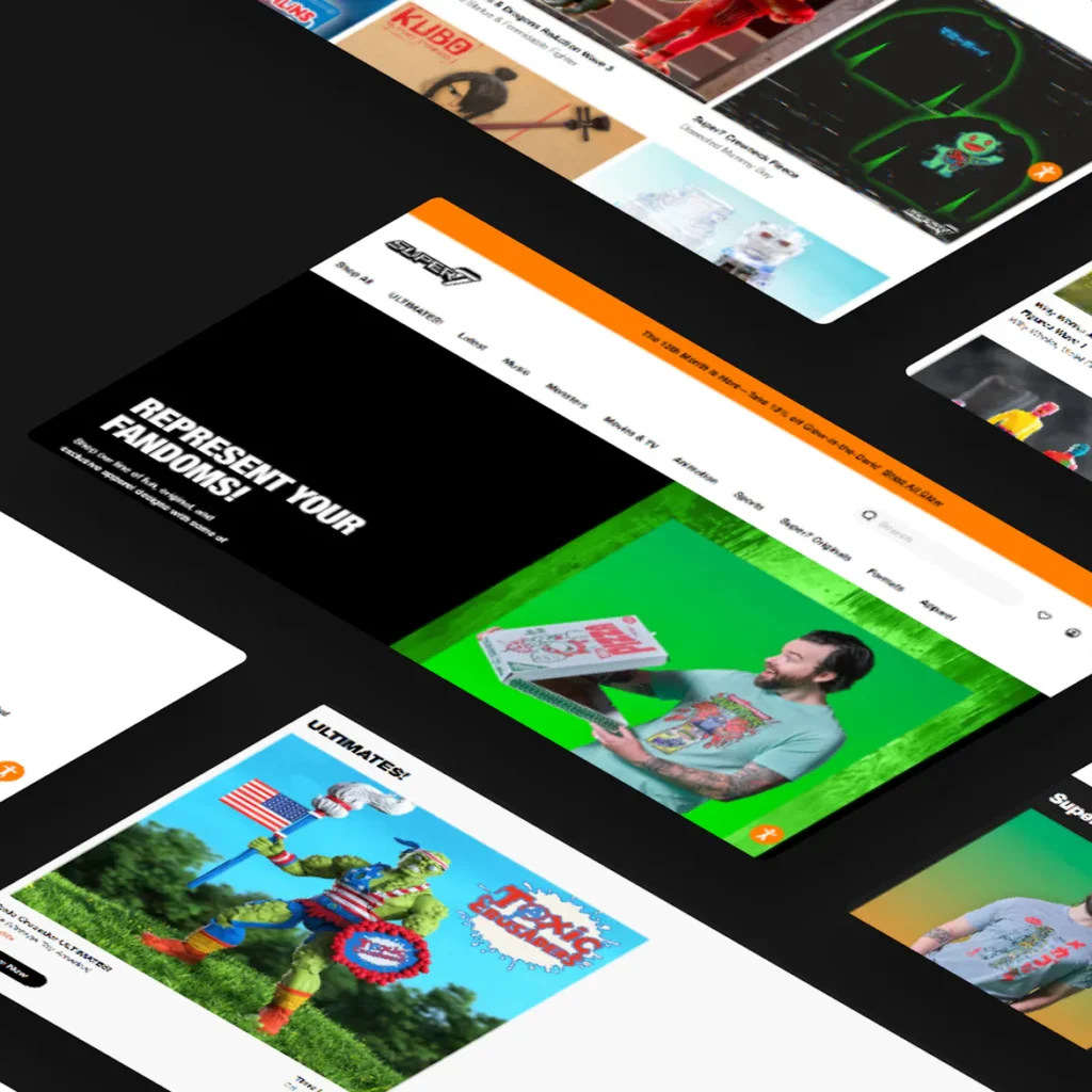
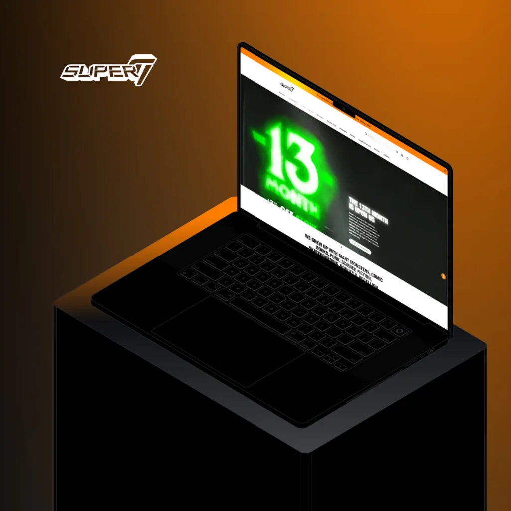
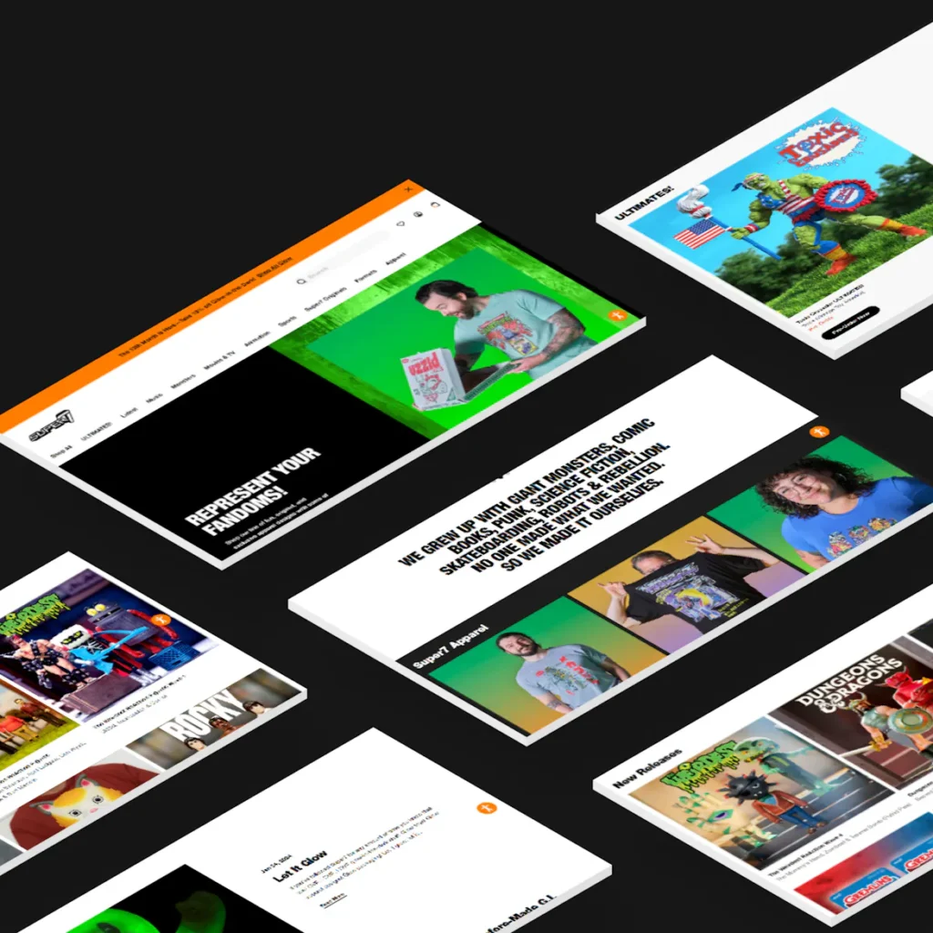
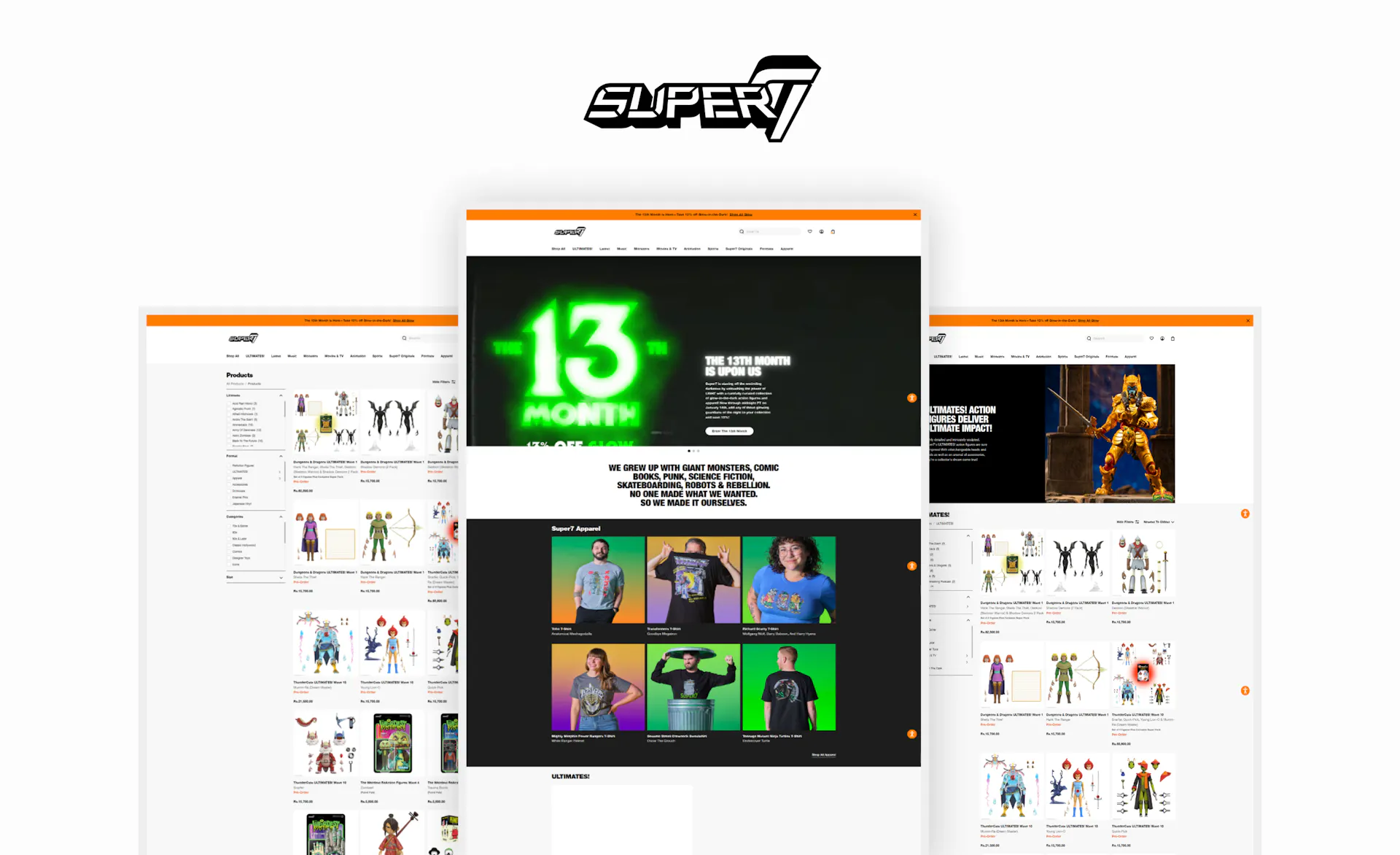
Introduction: In the dynamic realm of e-commerce, where creativity meets innovation, this case study unveils the collaborative journey between me and Super7. A powerhouse in pop-culture design and lifestyle collectibles, Super7 sought to elevate its online presence to match its vibrant and diverse brand identity.
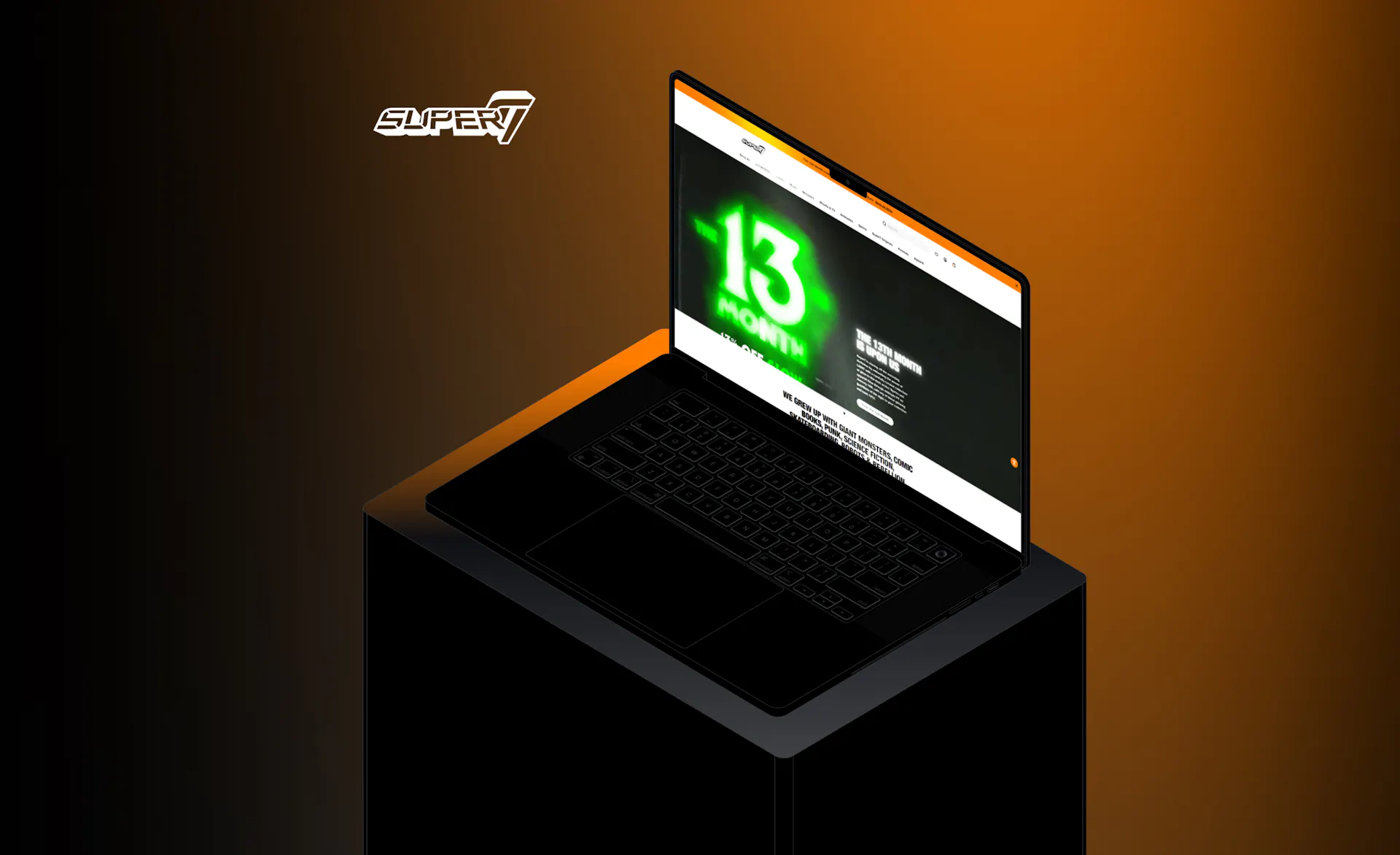
+ Shopify
+ CMS
+ Collaborative Integration
+ Secure Checkout
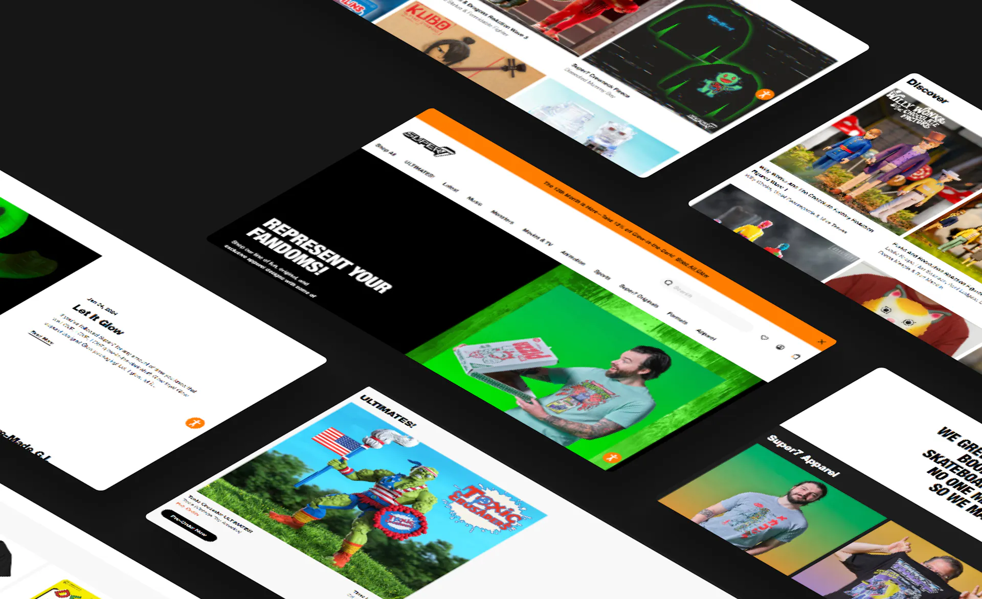
Result: Results: The Super7 Shopify website received accolades for seamlessly capturing the brand’s vibrant spirit and diverse product offerings. Enthusiasts worldwide embraced the user-friendly interface, making it a go-to destination for lifestyle collectibles. The website’s launch expanded Super7’s digital reach and provided a centralized hub for fans to explore and acquire their favorite pop-culture treasures.
Visual and typograpy hierarchy
Font Type: Playfair Display – Visual hierarchy is the principle of arranging elements to show their order of importance. Designers structure visual characteristics—e.g., menu icons—so users can understand information easily. By laying out elements logically and strategically, designers influence users’ perceptions and guide them to desired actions. Users notice larger elements more easily can convert. Regular Medium SemiBold Bold Regular Medium SemiBold Bold
RegularMediumSemiBoldBold
